The technology landscape is often defined by evolution rather than revolution; however, Apple’s introduction of the Liquid Glass design language feels like a profound leap into a new aesthetic realm. As a long-time observer of Apple’s design philosophy, it’s both exhilarating and unnerving to see such bold changes. Launched with great fanfare at the 2025 Worldwide Developers Conference (WWDC), this design overhaul captivates with its promise of an immersive user experience, yet it also presents a host of usability concerns that cannot be overlooked.
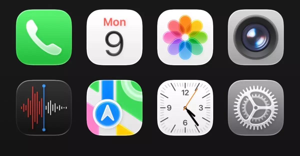
Apple’s Liquid Glass is visually striking, with its shimmering app icons, tab bars, and text magnifiers that suggest a fluid, almost ethereal quality. The design strategy aims to create an optical illusion that allows users to glimpse what’s beneath their apps, integrating functionality with artistic flair. However, as appealing as this concept is in theory, in practice it risks overshadowing the fundamental user experience. The dappled visual elements offer a new form of depth, but this enticing surface could lead to a muddied interface that complicates navigation.
Usability Under the Microscope
One cannot help but admire Apple’s relentless pursuit of minute detail. The Liquid Glass features a level of precision that is undeniably Apple: from the rounded edges of app icons to the fluid animations accompanying filter transitions. Yet, these enhancements come at a price. When first encountering the new layout, the overwhelming transparency transforms the iPhone into a kaleidoscopic experience that feels both futuristic and chaotic. The juxtaposition of the familiar and the new establishes a disorienting experience that could frustrate even the most dedicated Apple enthusiasts.
Navigation icons, for instance, appear more bubbly and ‘accessible,’ yet they also contribute to what can best be described as a visual clutter. This is especially evident in the Control Center, which feels haphazardly designed at this stage. While transparency might lend a chic modernity to the interface, it renders functional elements harder to identify. Aesthetics should complement usability, and at times, Liquid Glass seems to have pushed practicality to the side. Apple’s tendency towards perfectionism raises hopes that these concerns will be addressed before the final release of iOS 26.
The Good, the Bad, and the Inevitable Tweaks
Features like the new iOS keyboard and tab animations in applications like Clock reveal the potential hidden within the Liquid Glass design. The animated water droplet effect might be visually delightful, but it raises essential questions about efficiency. Is the aesthetic benefit worth potentially hindering speed and ease of access? The alarm toggling button, now more oval than circular, contributes to an overall impression of whimsical fluidity, albeit at the risk of compromising intuitive interaction.
Moreover, one cannot overlook peculiar design choices, such as the extensive whitespace in the Settings app. While it aims for a clean slate, this excessive spacing detracts from the app’s inherent functionalities, leaving users to battle with unnecessary scrolling. Such design inconsistencies signal to the seasoned observer that Apple may still be fine-tuning its vision.
Nevertheless, the potential for Liquid Glass to grow on consumers exists. As familiarization occurs, the initial shock of dramatic visual changes may well evolve into a sense of appreciation. Just as many users found solace in the radical departure of iOS 7, the same pattern may apply here, assuming Apple responds to user feedback ahead of the official iOS launch.
A Calibrated Approach to Innovation
In essence, Apple’s Liquid Glass design language is a beacon of ambitious innovation that ultimately leaves both excitement and skepticism in its trails. Such a bold pivot risks eroding the user-centric design approach that the brand has fought hard to cultivate. What remains to be seen is whether Apple will exercise its characteristic adaptability and refine this latest feature into something that marries visionary design with the practicality users have come to rely on.
As technology fans await further updates on iOS 26, the anticipation of witnessing how Liquid Glass develops will certainly linger. While it stands as an impressive concept, it must not become another example of form overshadowing function. In a world where user experience reigns supreme, only time will tell if the shimmering allure of Liquid Glass can withstand the test of reality.
Leave a Reply