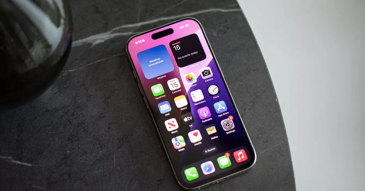
In the rapidly evolving landscape of consumer technology, our smartphones stand as both indispensable tools and sources of distraction. As someone thoroughly immersed in mobile photography and telecom insights, I’ve come to recognize the inherent struggle we face with smartphone organization and navigation. The traditional grid pattern of apps, familiar yet stifling, often creates clutter that detracts from the user experience. This article delves into the growing awareness of minimalist designs within smartphone interfaces and the liberating effect of rethinking app management.
Smartphones, in essence, are our digital companions, yet the weight of endless app icons can feel overwhelming. My experience with the iPhone, once simple and unblemished, has transformed into a battleground of notifications and icons vying for attention. With the increasing number of applications — 60, in my case — it became clear that the conventional homescreen design is no longer effective. Initially conceived to offer organization, the grid now feels akin to throngs of people in a crowded room, each clamoring for attention.
The shift towards alternate operating systems, particularly Android, has offered users a reprieve through features like app drawers and customizable launchers, allowing a move away from the traditional homescreen. Apple’s introduction of widgets and the app library with iOS 14 represented steps in the right direction, though the journey toward a truly customizable experience feels only partially complete.
The recent advancements with iOS 18 have truly revolutionized the homescreen experience, granting users unprecedented freedom in how they arrange their devices. The ability to position apps and widgets anywhere has opened up new avenues for personalization. Inspired by colleagues who have embraced a minimalist approach, I felt compelled to reassess the utility versus the distraction of every app on my device.
Eliminating excess from my homescreen required considerable introspection. Why should a seldom-used parking app occupy valuable space? My goal became clear: to create a streamlined interface that minimized distraction while maximizing efficiency. The end result — an uncluttered layout featuring only essential applications and a smattering of functional widgets — has significantly enhanced my productivity. I now refer to my new setup as “Minimalist Mobile 2.0,” aptly reflecting this refreshing perspective.
The Benefits of a Minimalist Interface
One of the most striking improvements I’ve observed is my interaction with the Siri suggestion feature, which has proven remarkably effective. My reliance on app notifications has diminished significantly since embracing this new approach; after all, if the icon isn’t directly before me, the urge to check it dissipates. This newfound distance from constant notifications has given me the mental clarity I crave. Whether I type the initial letters of an app’s name or rely on Siri’s suggestions, I find what I need in mere moments.
However, the shift wasn’t without challenges. The absence of constant visual cues required a reorientation in my daily routine. Occasionally, reminders would slip through the cracks, as dismissing notifications without seeing them face-to-face turned into days of unintended oblivion. Nonetheless, I’ve come to appreciate this unencumbered landscape as an opportunity to declutter my digital life.
Learning from Others’ Experiences
In my quest for a balanced digital life, I spoke with colleagues who have taken this minimalist philosophy to heart. One particularly intriguing strategy came from a colleague known for his functional approach to app management. By replacing standard app shortcuts with grayscale icons and adopting a user-defined organization method based on tasks instead of application types, he has successfully minimized distractions. His system eliminates the temptation of impulsively engaging with time-consuming apps, promoting a mindset around productivity and intentional use.
Another colleague has embraced a more practical approach by limiting the number of apps visible on his homescreen. With only seven icons in play, he maintains a straightforward interface, occasionally recalibrating the layout based on immediate needs. This practice not only curtails distractions but allows for the fluidity required in today’s fast-paced environment.
Collectively, we recognize that the evolution of app management signifies a progressive shift in how we interact with technology. The decline of the cluttered grid symbolizes a broader trend towards mindful usage, emphasizing the importance of cultivating a less distracting digital space. Our devices are not merely tools; they are extensions of our lives, and it’s crucial that they adapt to our evolving needs.
Ultimately, the aim isn’t just to embrace the latest technology trends but to harness the available innovations actively to enhance our daily experiences. As we learn to navigate our devices with intention and purpose, we pave the way for a future where digital simplicity reigns, proving that we can reclaim our attention and time from the overwhelming chaos of curated distractions.


Leave a Reply